The journey of a brand refresh of the Startup Wise Guys
We all know that one moment you realize your old suit no longer fits you. Not only is it inevitably out of style, but it is also far from telling your current story. Your growth, experience, and newfound insights are begging to be expressed, signaling it’s time to bid farewell to the old and embrace a reflection of your current self and brand. After countless self-reflection and brainstorming sessions, we’re thrilled to introduce our new logo, a fresh face that embodies the story of our evolution.
How it started
11 years ago, the Startup Wise Guys logo was created as a direct reference to Dave McLure’s coined term “Estonian Mafia” referring to many Estonian tech founders in Silicon Valley, and the 1986 movie “Wise Guys”. As cool as the mafia idea seemed in 2012 in a newly emerging startup ecosystem where everyone wanted to be a part of a secret gang, this setting didn’t stand the test of time. The idea of a closed group doesn’t seem to fit a way more mature and established ecosystem and company anymore. As our founders’ perspective evolved over time, they made the natural transition from using the term “mafia” to “family,” highlighting the real source of our community’s strength: its diverse international composition. With over 65 nationalities represented in our portfolio and a team comprised of over 20 different nationalities, our community thrives on being inclusive, welcoming, and supportive. There are so many stories about how our community has been interacting over the years. Some of our founders have gone on to join other startups after successful exits, or upon the completion of their journey with us. Startups have invested in other portfolio startups or our newer funds. This year we are even celebrating a marriage that came from our portfolio! Not even speaking of the day-to-day support and advice the community shares with each other.
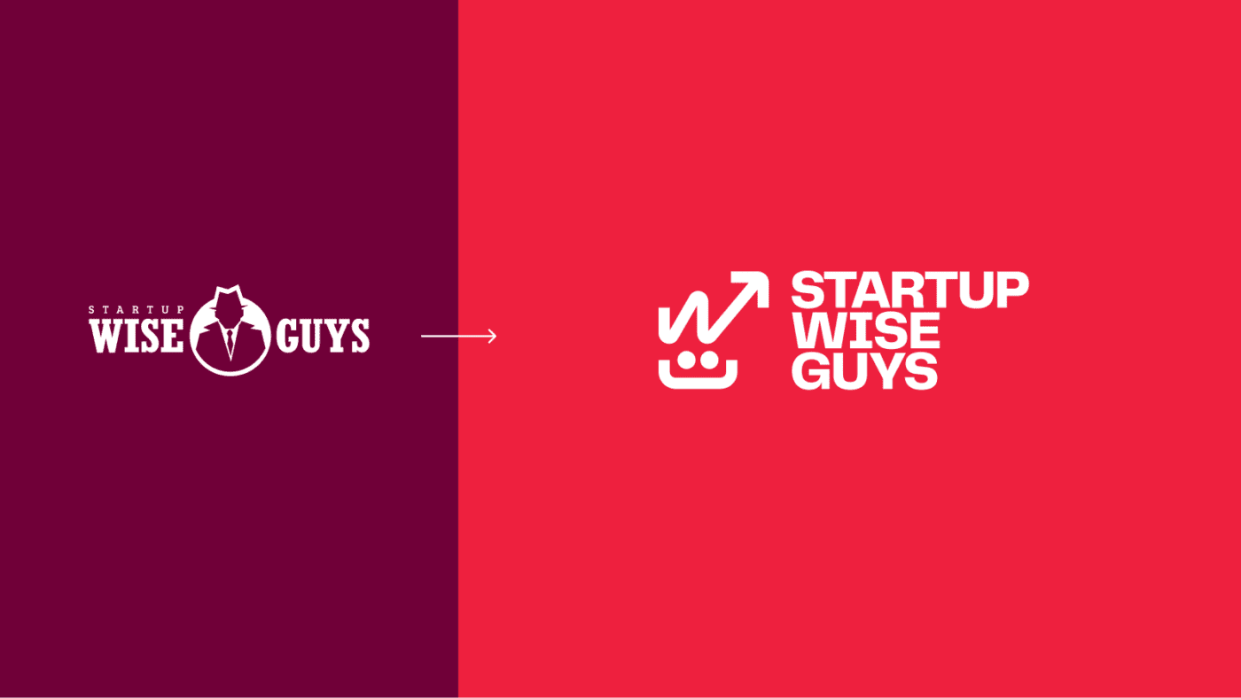
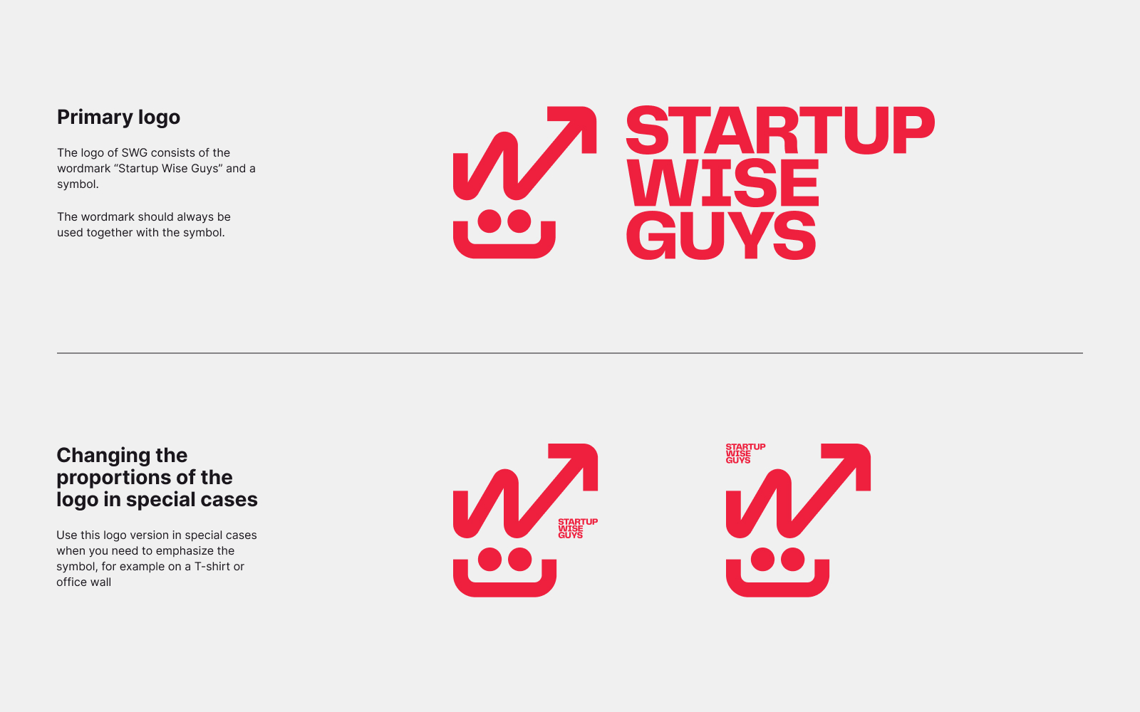
So, it was no surprise that a human figure came to the forefront of the creative process of the brand refresh. Our old, anonymous, face-less “mafia guy” started to come out of the shadows. And guess what – turns out it has eyes and a big happy smile – which goes both for our approachability, and for the big love of humor in the company.
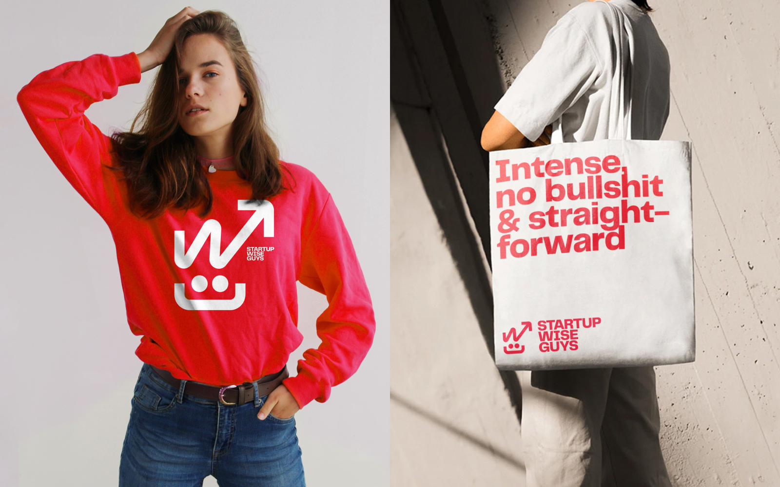
The color of red was the only thing we were sure was an essence of the Startup Wise Guys brand and was meant to stay untouched. For us, it is synonymous with energy, passion, boldness, bravery, and the human side of tech – as in our case, it is the founders and their passion and purpose for what they are doing that makes up our daily lives at the accelerator and investment fund.
No doubt, 10 years nowadays is a lot of time that holds a lot of changes in generational differences, economy and society. We have gone through a pandemic, informational war and still going through a very real one. We wanted and needed a refresh to keep up not only with digital and marketing world requirements but also with the way how people actually feel and what our younger audiences are looking for in the world right now. Despite the fact that we also had numerous discussions about the brand name and should we change it, we still stand strong in our opinion that the word “guys” is gender neutral. And the fear of words being gender exclusive is more of a problem than the words themselves. It was more important for us to give a face to our team of people with different pronouns so we can always find each other in the crowd.
And how it goes
We are happy to finally reveal our changes to you and to continue being your familiar face in the sea of VCs and accelerators. Zooming in on the logo there’s lots of beautiful playfulness and lots to unpack. Its creativity and room for exploration was something that we also found appealing. We got hooked on the idea that the logo remains so interpretable that everyone can see the part of startup life they resonate with the most.
Some people, when we initially showed the logo, didn’t see the smiley face, but they did notice the “w” letter with an arrow and instantly said “Of course, it’s the crazy entrepreneurial journey with ups and downs”, and hopefully an upward- looking tendency. So many of our startups show similar graphs when we ask them about their MRR, financial projections, or daily decision-making “frequency”. Welcome to the rollercoaster!
Some team members and experts said “I don’t know, the logo is kind of complex, and it also looks like it is leaning a bit to one side, so not really symmetrical – are you sure this is what you want?” Fun fact, it actually made us want it more and fall in love with this version above all others. Why? Because it shows both the complexity of our business and the business journey as such (there are lots at play), but also – it is not perfect, it is not ideally balanced, because it shouldn’t – perfection is a luxury that most entrepreneurs cannot afford and should not strive for in their early stages.
An afterword
When we started the process of the brand refresh, we thought it would take up to three months. That was a year ago. It turned out to be not only longer, but also a way deeper and personal journey than we expected.
We are quite a transparent and inclusive team – it is great most of the time, but the brand refresh process put it to the test for sure. Instead of making the changes within a marketing team and launching it as a surprise for everyone, we had many stages involving the whole team: explorative expert groups, a smaller working group, check-ins with the Board and many discussions and presentations. Everyone had a say, and in the beginning, only a few people were willing to disrupt the brand. Most were rather conservative, both the ones who have worked since the beginning and those who had joined recently. But also, most of the team had a change of heart and understood the need for refresh when given an opportunity to think about all the objectives. Many external stakeholders (startups, investors, mentors) started the call with “why are you considering a change at all”, but most finished the call with – “yes, you definitely need a change”. Although many of the involved experts noted that Startup Wise Guys have actually managed to pull off an outdated brand for years mostly because of our culture, team vibe and community, many also understood that the old look puts an obstacle on reaching the ambitious business goals in the future. The final verdict was that we have outgrown ourselves and cannot rely on what our loyal customers think of us. We are rapidly becoming bigger and way more global, and we are in a position to introduce ourselves as who we are right now and where we are headed to.
Overall, we couldn’t be happier with the new face of Startup Wise Guys. We believe it tells the story of the founders and what it actually takes to become an entrepreneur. And our story really is all about the founders! Nevertheless, the logo also emphasizes our growth, geographic expansion and getting a certain maturity of what we do and offer.
So, here’s to the next 10 years!
And here’s to the team working on this change – the heart of the project – our Head of Brand, Zane Bojare, the execution power – Marketing Operations Manager, Luize Sila, the website guru – Digital Marketing Manager, Ismael Cruces, the content fairy – Marketing Coordinator, Tatiana Daushvili, our Board with CEO Cristobal Alonso and Co-founder Herty Tammo. Big Thanks go to our many internal and external experts- our designer guru Līga Felta and motion designer Emīls Kālis, as well as an external superpower – branding agency Fraktal, brand consultant Jurate Puodziukaite, copywriters Kristine Jansone and Eve Willis. 🍾🥂
February 15, 2023